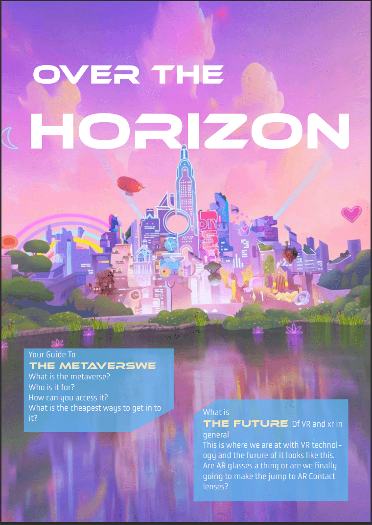
This is a magazine layout that I created for a fictional magazine. I worked on the entire branding for it and I wanted to create something that was visually interesting and engaging, so I decided to use a combination of different fonts and colors. I also included some illustrations and photos to add some visual interest and break up the text. I think the final result turned out really well and I'm really happy with how it looks.
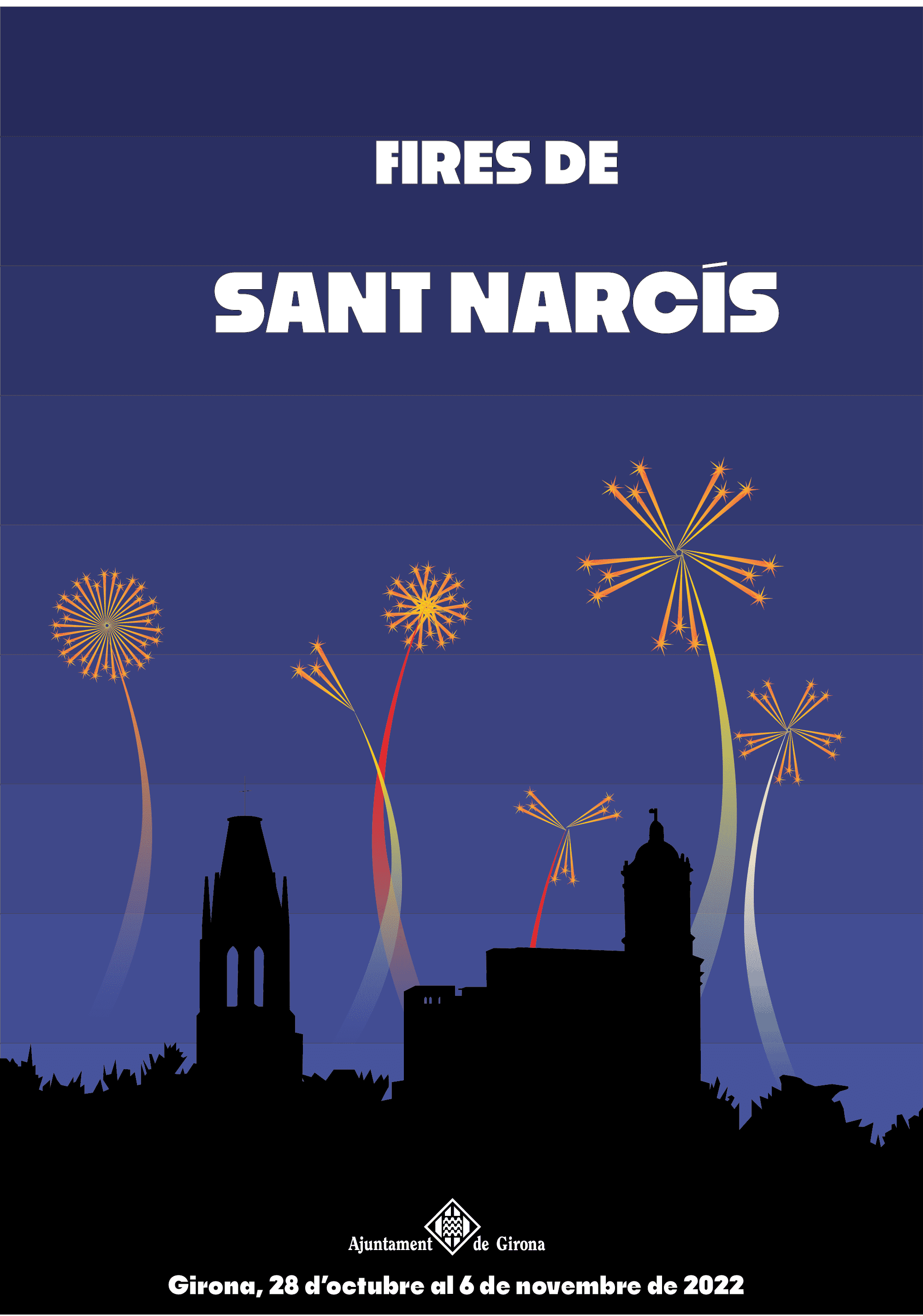
This is a project I did for the Fires de Sant Narcis. I was in charge of creating the poster for the event. I wanted to create something that was fun and colorful, so I decided to use bright colors and a playful font. I also included some illustrations of the different activities that would be taking place at the event. I think the final result turned out really well and I'm really happy with how it looks.
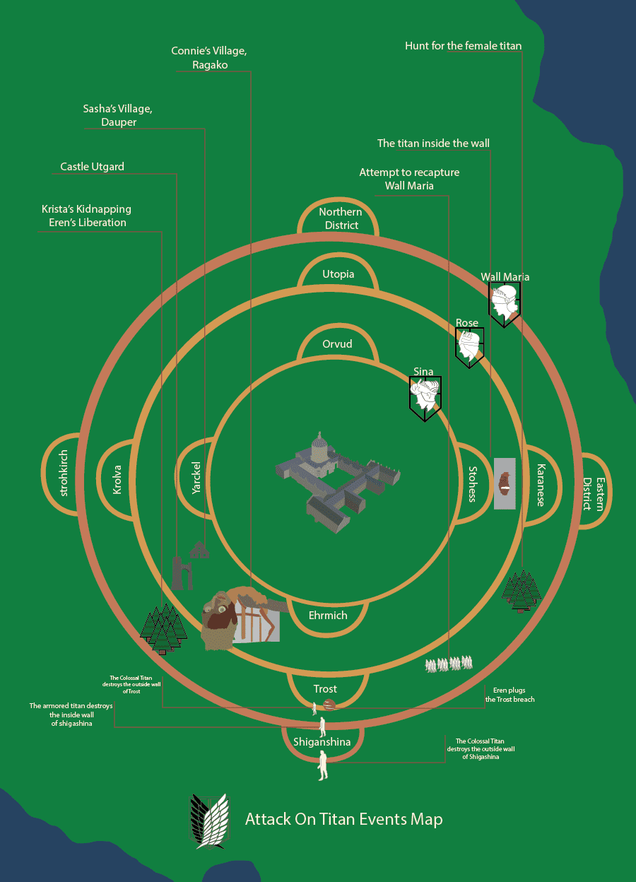
This is a map that I made based on the anime series Attack on Titan. I wanted to create something that was detailed and accurate to the show, so I spent a lot of time researching and planning out the layout of the map. I also included some illustrations of the different locations and landmarks from the show. I think the final result turned out really well and I'm really happy with how it looks.
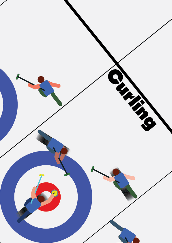
For this project we were tasked with describing a sport with a poster. I chose curling because it is a sport that is not very well known and I thought it would be interesting to learn more about it. I decided to use a simple and clean design for the poster, with a focus on the equipment used in the sport. I also included some information about the rules and history of curling. I think the final result turned out really well and I'm really happy with how it looks.
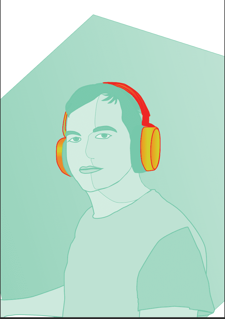
This is a self-portrait that I created using a combination of photography and illustration. I wanted to create something that was unique and personal to me, so I decided to use a photo of myself as the base and then vectorize it. I also included a shape as the background to add some visual interest, and one element from the photo that I wanted to highlight in another color.
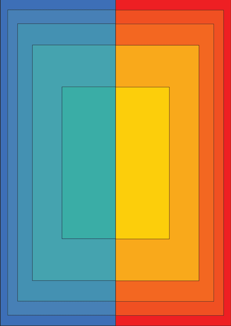
This is a project I did where I had to create a series of abstract shapes. I wanted to create something that was visually interesting and dynamic, so I decided to use a combination of different colors. I also played around with the placement and size of the shapes to create a sense of movement and depth.
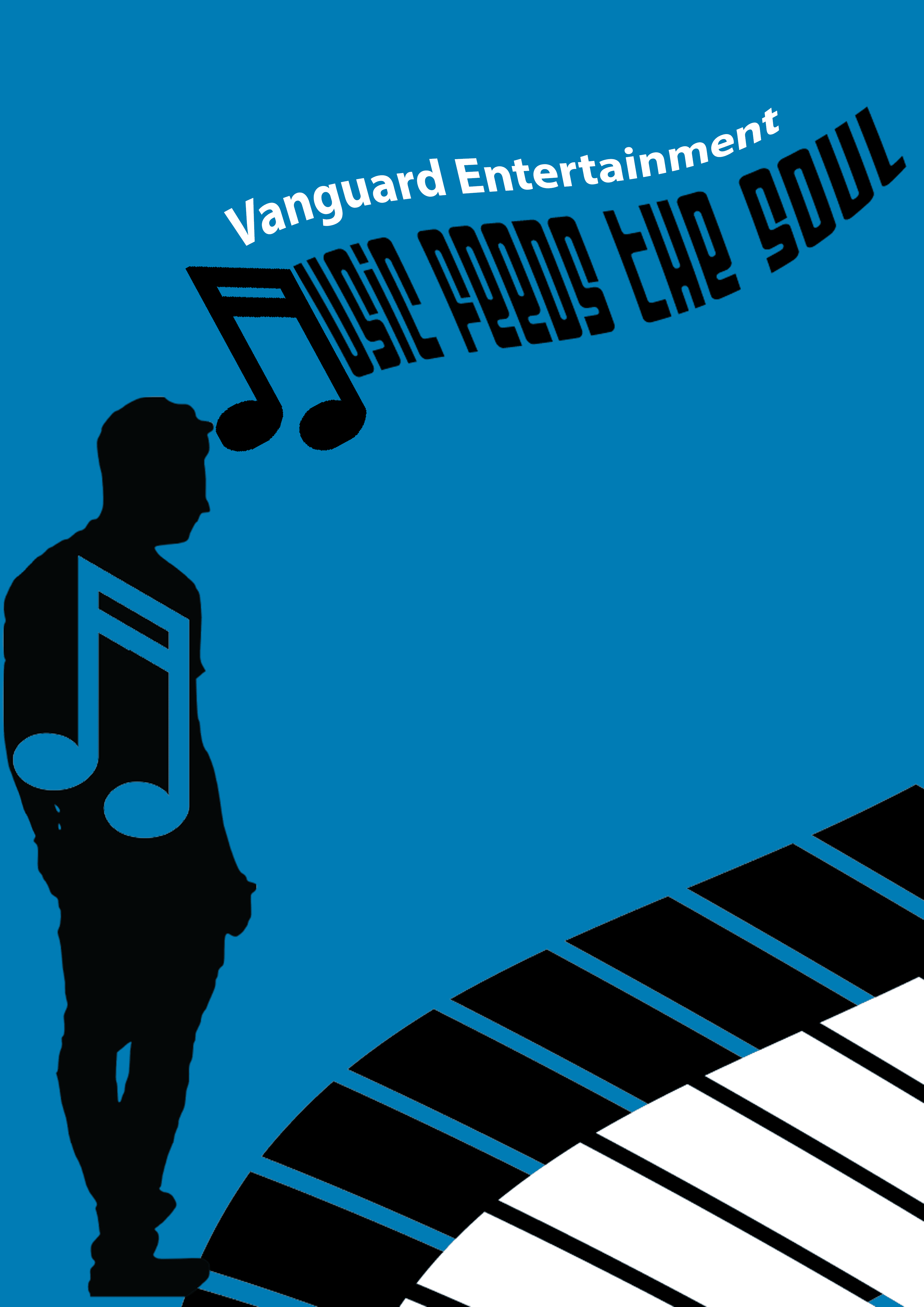
This is a project I did for Vanguard Entertainment (fictional company). I was charged with creating a poster with the phrase "Music feeds the soul." I wanted to create something that was visually interesting and engaging, so I decided to use a combination of different fonts and colors. I also included some illustrations and photos to add some visual interest and break up the text. Played with the composition and the placement of the elements to create a sense of meaning to the phrase and to make it visually appealing. And this is the final result.